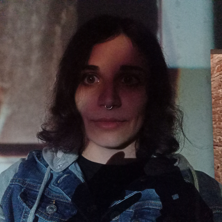
Speakers
2023
See who has been in previous editions of Data Stories here.
See who has been in previous editions of Data Stories here.

Statistics Vienna
Title: Vienna in Figures – Communicating City Data
Description: The talk sheds light on the data communication activities of the City of Vienna, with a focus on data visualisation projects by Statistics Vienna.
Bio: Ramon Bauer is Head of Statistics Vienna. After early careers in music and web companies (during the 1990s), Ramon studied Geography at the University of Vienna and worked at the Vienna Institute of Demography (Austrian Academy of Sciences) and at the University of Vienna, where he coordinated the 4CITIES Erasmus Mundus Master Programme in Urban Studies. Since 2017, Ramon is responsible for population data, analysis and projections at the City of Vienna. His research interests include urban diversity, spatial demography, population projections as well as data communication and visualisation.

Complexity Science Hub Vienna
Title: Unlocking the Beauty of Complexity Science
Description: How can we ignite the spark of creativity in our data visualizations to make intricate data and abstract models come to life? Discover the techniques and strategies that will transform your research communication into an enlightening experience.
Bio: Liuhuaying Yang is a data visualization researcher at Complexity Science Hub. Her expertise is in design and front-end development of interactive data visualizations on the interface of academic research and applications. She has worked with the Massachusetts Bay Transportation Agency, the MIT Senseable City Lab and SMART Future Mobility in Singapore as a data visualization specialist, and SPH Lianhe Zaobao in Singapore as a data visualization designer for interactive data journalism projects. Her work has been awarded the first prize in the 2019 TRB Innovations in Transit Performance Measurement Challenge and recently won first place in the interactive category of the World Dataviz Prize 2023.

Tech artist & Data viz designer
Title: Linking Subject & Object with Data Viz
Description: This talk will take a step back to look at the context of visualization and viewer, and ways to help viewers connect to the data using design and visual art techniques.
Bio: Alice Grishchenko is a design generalist with experience in illustration, animation, data viz, game design and virtual reality. She received her MFA in digital animation and interactive media from the Ohio State University. She has previously worked as an interactive media designer at Nationwide Children's Hospital and as a data visualization specialist at the Center for Complex Networks Research in Northeastern University. Alice is currently working on many things, as a tech artist or data viz designer, she is always learning something new.

UX Researcher at Curvenote
Title: 10-Seconds to Understand: Designing Dataviz for Speed
Description: This talk is about speed — how you can use design principles to help people understand your dataviz FASTER. As a bonus, you’ll also get a glimpse into how future scientific articles will accommodate better data visuals.
Bio: Dr. Mike Morrison is a User Experience (UX) designer with a Ph.D in Work Psychology. He’s trying to bring User Experience design principles from the tech industry to science to help spread knowledge and information faster between scientists. He's most known for creating the viral #BetterPoster YouTube cartoons, which influenced the way that hundreds of thousands of scientific studies were communicated. Now he's working with other science communicators to bring more effective and accessible designs to all areas of science. Mike has given workshops on design and science communication at many wonderful organizations including Harvard University, the US Centers for Disease Control, Microsoft Research, and Johns Hopkins. He is currently the Lead User Experience Researcher at Curvenote, a scientific software startup aiming to redesign the way scientific journal articles are written and published.