Print Visualizations at Data Stories 2025
Author:
Federica Gazzelloni
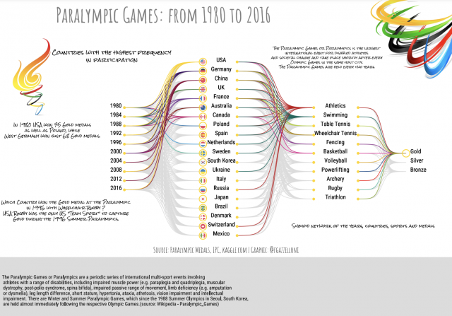
This visualization includes the first 20 countries with the highest frequency of participation. Those who won a gold medal are connected with a colored sigmoid, while the other silver and bronze medals are in grey color. Colors are to identify different countries and sports. Among all participating sports, some favorites have been selected: athletics, swimming, table tennis, wheelchair tennis, fencing, basketball, volleyball, powerlifting, archery, rugby, and triathlon.
The visualization is made with RStudio, in particular, the sigmoids are made with the geom_sigmoid() function from the {ggbump} package, the flags with ggflags::geom_flag, and the text with geom_text.
Two images with the symbol of the Olympic torch and the Paralympic circles are taken from the internet. All mentions of Paralympic facts are from Wikipedia:
- https://en.wikipedia.org/wiki/1980_Summer_Paralympics_medal_table
- https://en.wikipedia.org/wiki/Wheelchair_rugby_at_the_Summer_Paralympics
- https://en.wikipedia.org/wiki/Paralympic_Games
Data Source: International Paralympic Committee (https://db.ipc-services.org/sdms/hira/web/index)
Data Visualization: Federica Gazzelloni (@fgazzelloni)
The graph was posted originally on Twitter as part of the #TidyTuesday 2021 week 32 competition.