Print Visualizations at Data Stories 2026
Author:
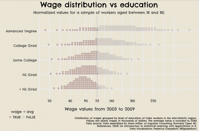
Federica Gazzelloni
Data Source: Assembled by Steve Miller, of Inquidia Consulting (formerly Open BI).
References: (2013) An Introduction to Statistical Learning with applications in R.
Data Visualization: Federica Gazzelloni (@fgazzelloni)
The graph was posted originally on Twitter as part of the #30DayChartChallenge Edition 2022 Day 9 - Statistics.